The Idea — Energy, shown instead of claimed
Every performance shoe promises energy return. Few campaigns ever show it. This one is built on a single rule: every step has consequences. Each ground contact triggers a visible reaction (dust, debris, water), and that reaction drives the camera, the cut and the city around the runner. Impact, reaction, next step.
Visual Language — A city as a performance space
Hard, neutral daylight instead of warm lifestyle romance. Asphalt, concrete, water and hard architectural lines as the stage. Camera moves that stay close to the body (tracking, orbit, top shot, under-foot), so speed is felt rather than described. The product stays readable in every frame: sole, cushioning and contact zone carry the story.
Typography & Brand — Four words, one system
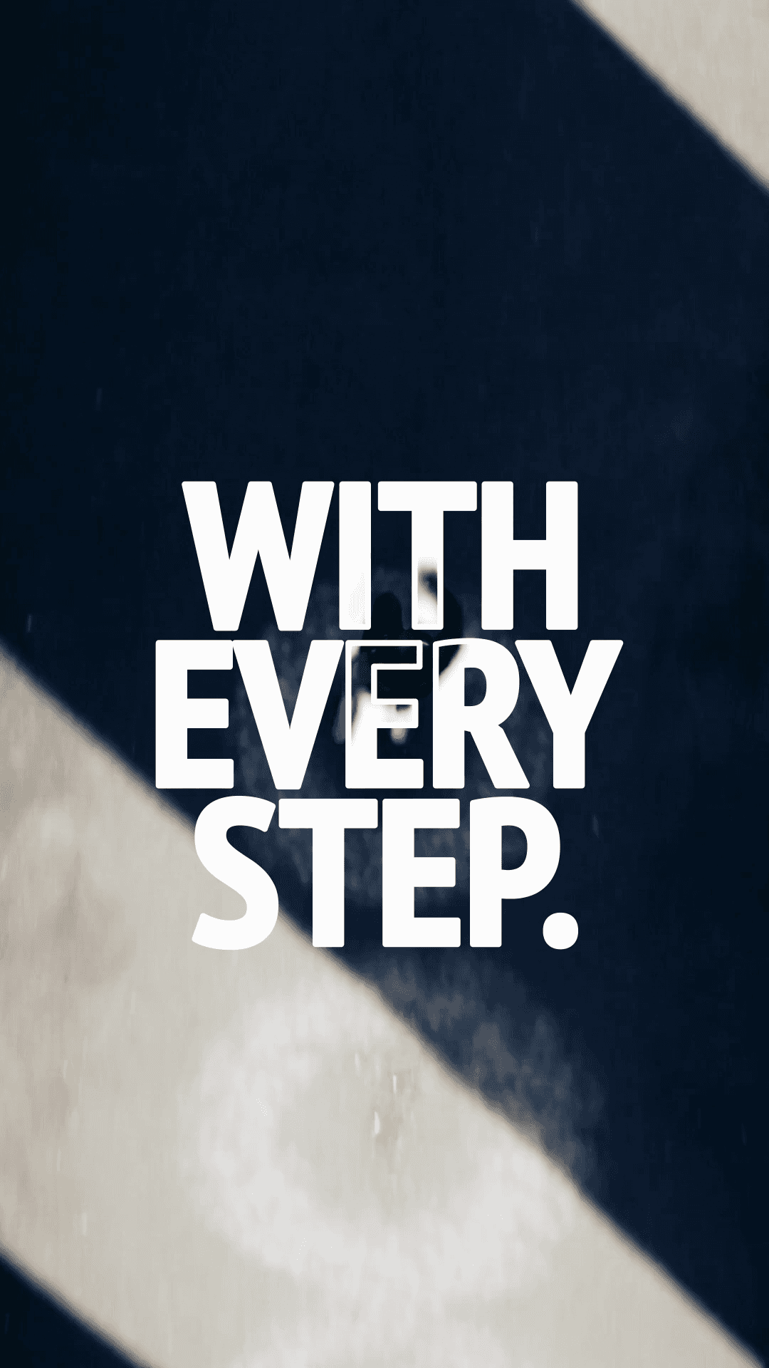
The campaign line runs in three beats: ENERGY. RETURNED. WITH EVERY STEP. Each beat is set in the same condensed grotesk, at the same size and on the same axis, with no glow, no shadow and no outline. The type lands with the impact it describes. The film closes on a product endcard that resolves the whole system into one frame.
Production — From concept to final grade
Concept, shot design, generation, edit, sound and grade all came out of one studio. The grade is measured, not eyeballed: cool and neutral in the background, warm on skin, consistent across every shot. The result is a fifteen-second spot that could sit in a real campaign rollout, built in a fraction of the time and budget of a conventional production.